Messenger
Designing a secure, action-driven communication platform for regulated trading, bringing messaging, document workflows, and verification into one coherent experience.
About the project
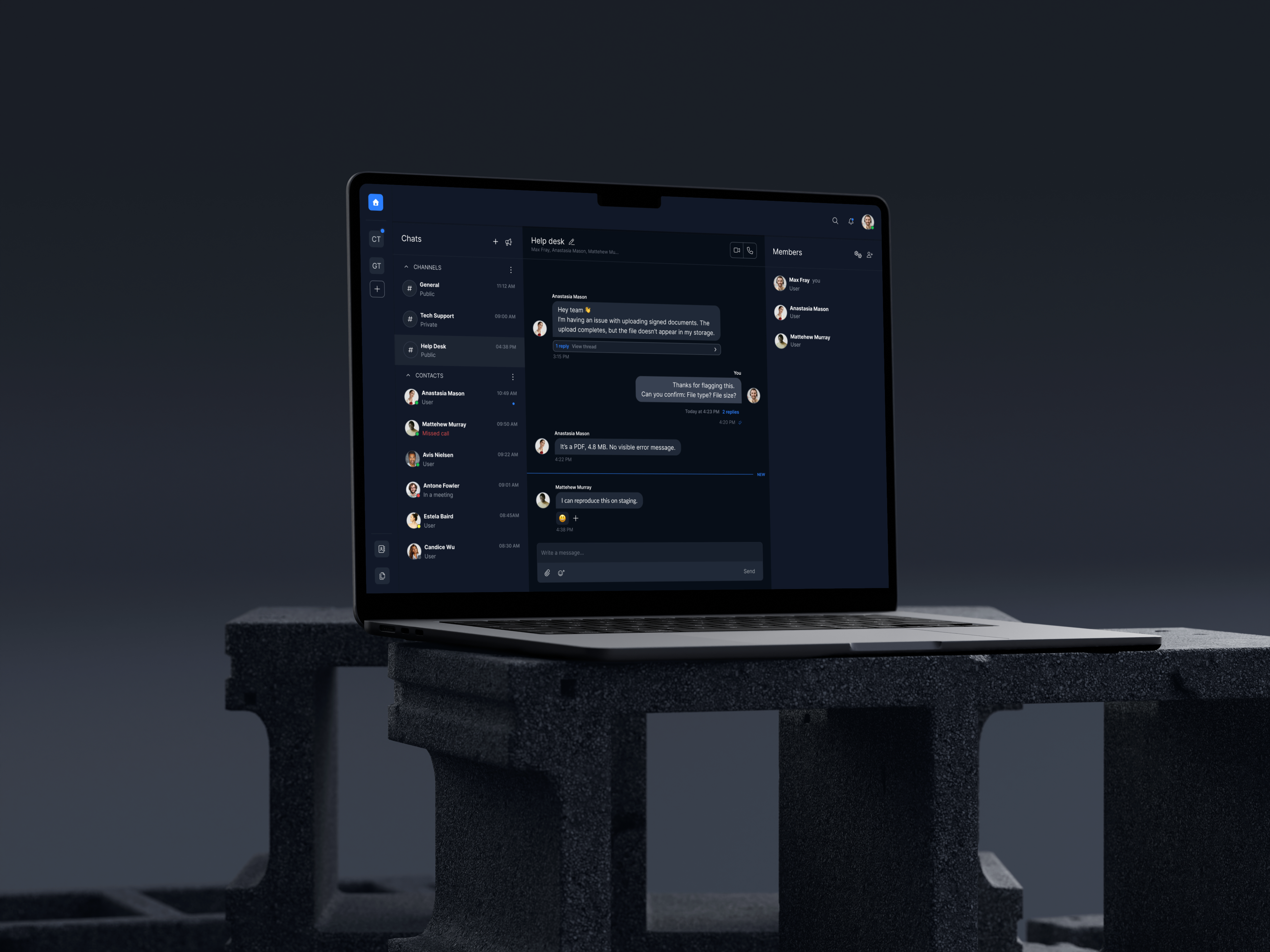
Messenger is a secure communication platform for regulated enterprise environments. It connects messaging directly to document management, verification workflows, and transaction records, so conversations stay tied to their documentation and compliance, instead of living in a separate chat tool.
My role
I worked on Messenger as one of two designers, owning the end-to-end design of the core communication and document workflows, from research through to engineering handoff. Much of the work was turning fragmented, high-risk trading communication into one secure, compliant experience.
Design goal
- Build secure, compliant communication workflows
- Bring document sharing directly into the conversation layer
- Make actions and security status discoverable at a glance
Discovery
I audited existing communication workflows, tracing how messages and approvals moved across disconnected tools.
Research
Analyzed compliance gaps and context-switching patterns to define core design principles.
Information Architecture
Translated research into a navigation model that embeds actions directly into the conversation.
Validation
Tested key flows with internal users, iterating with product and engineering before handoff.
Research Approach
To understand where Messenger was failing users in regulated enterprise environments, I audited the current experience against real compliance-bound workflows.
Research methods
How I worked
Research process
How synthesis turned research into the key findings that shaped the design direction.

Key findings
Context Switching
Workflow audit showed traders were switching between 4+ tools to send messages, share documents, and track approvals, leading to missed deadlines and compliance risk.
Compliance Gaps
Compliance review found existing tools lacked audit trails and retention controls, and without visible security status, users had no way to trust that sensitive conversations were protected.
Action Friction
Workflow audit surfaced that approvals and document requests were buried in long chat threads, making it hard for users to spot what needed their attention.
Administrative Control
Competitive analysis confirmed enterprise adoption depends on administrative control, requiring flexible permissions and monitoring before teams could rely on the platform.
Competitive analysis
Each tool solves part of the problem: speed, security, or compliance. Trading teams need all three in one place.
Competitor Comparison
| Feature | Slack | Teams | Signal | Messenger |
|---|---|---|---|---|
| Audit trail | ✕ | ✓ | ✕ | ✓ |
| Document workflows | ✕ | ✕ | ✕ | ✓ |
| Compliance policies | ✓ | ✓ | ✕ | ✓ |
| Ecosystem integration | ✕ | ✕ | ✕ | ✓ |
| Action-driven UX | ✕ | ✕ | ✕ | ✓ |
Opportunities
Unified action surface
I proposed merging message, document, and verification into one composer.
Compliance by design
I proposed surfacing audit trails and retention controls directly in the message UI.
Attention prioritization
I proposed triaging pending approvals and document requests in one view.
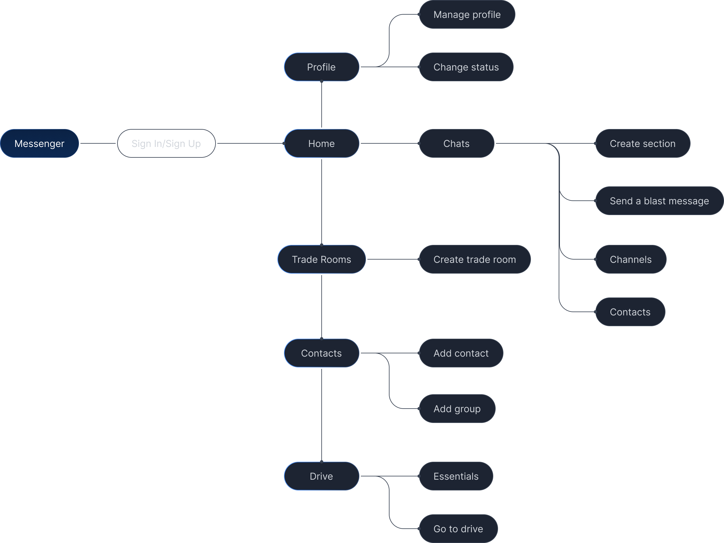
To support complex trading workflows, I structured Messenger into clear communication, document, and transaction modules. Each maps to a distinct stage of a trade's lifecycle, so the structure itself guides the user instead of relying on them to remember how fragmented tools connect.
Before & After
Three key changes: navigation structure, trading room design, and document storage integration.
Landing screen
Before
Traders scanned every chat manually, with no way to tell what needed action first.
After
A triage inbox surfaces pending approvals and unread requests at the top, with pinned chats for active deals below.
Trading room
Before
Traders had to leave the conversation to check prices or instrument details.
After
A contextual sidebar shows linked instruments and live prices next to the conversation, so traders act without switching context.
Document sharing
Before
Recipients had no clear next step after receiving a shared file.
After
Documents appear as structured cards with the review or sign action built directly into the message.
Validation Approach
To validate design decisions, I conducted iterative usability sessions with 5 to 6 internal users throughout the process. Sessions focused on core workflows: navigation, document sharing, and trading room access.
Methods
Tasks & Findings
5 tasks tested across 2 sessions with 5 to 6 internal users.
| Task | Session 1 | Session 2 |
|---|---|---|
| Find a contact and send a message | failed | passed |
| Create a trading room with members | partial | passed |
| Share a document from storage within chat | failed | passed |
| Upload a file to a conversation | failed | passed |
| Check if a message was delivered | failed | passed |
Key Findings & Resolutions
Navigation confusion.
I restructured the IA, surfacing Channels and Contacts at the first navigation level.
Trading room discoverability.
I surfaced room creation as a primary action with clear naming and member roles.
Document sharing gap.
I integrated a document storage panel directly into the conversation, so users could search, select, and attach files inline.
Delivery confirmation.
I added read receipts and delivery indicators to all messages.
Workflow Efficiency
I integrated document and transaction actions directly into conversations, so users no longer needed to switch between messaging, storage, and signing tools to complete a single workflow.
context switchingUser Experience
I restructured navigation and added explicit error states, resolving the most critical usability gaps so users could complete core tasks confidently.
task clarityProduct Value
I designed permission-based trading rooms and embedded document workflows, creating a compliance-ready communication layer aligned with enterprise security and audit requirements.
enterprise readinessKey Learning
Designing for regulated environments meant every UX decision carried a security consequence, requiring continuous alignment with product, compliance, and engineering throughout delivery.
cross-team alignmentA few things that shaped the work, and what I'd approach differently next time.
Hardest decision
Action scope conflict.
The trickiest part was file and message actions overlapping in the UI. I split the scope cleanly: the message menu owns message-level actions, the file menu owns file-level actions. Errors added another layer, since failures could be hard (wrong format, too large, can't retry) or soft (network, timeout, retryable), each needing distinct treatment across the full set of failure combinations.
Document sharing integration.
Another was how shared documents should live inside the conversation. I weighed linking straight out to document storage against a unified page with no extra authentication, and we landed on a sliding sidebar with the user's own files, letting them attach directly from the conversation, plus a link out to document storage as a secondary option.
Constraints & what I'd do differently
With more time upfront, I'd map the full edge-case matrix before diving into interaction detail, rather than surfacing new failure combinations as I went. Defining hard and soft error scenarios earlier would have caught the mobile/desktop menu conflict sooner, before it reached engineering.